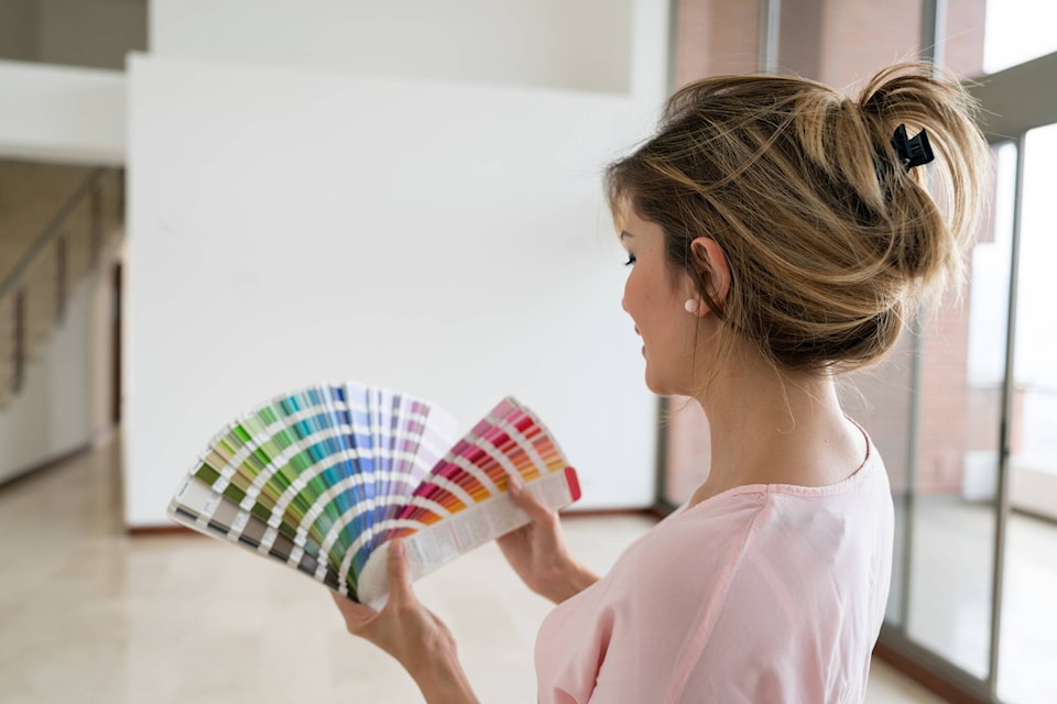
Picking out a paint colour you’ll want to live with for years is perhaps one of the hardest design decisions to make. When we analyze a tiny paint chip, it’s hard for us to imagine how the colour will look once brushed across an entire wall. And forget about envisioning how the hue might change in varying types of light.
Since the human brain is pretty bad at imagining how a paint colour will look, carefully testing out paint swatches before buying a gallon is the best way to avoid painter’s remorse. To learn the right way to pick out paint colours — and the mistakes to avoid — we asked the paint pros. According to the experts, here are six common mistakes people make when choosing paint colours, plus what to do instead.
1. Making the decision too quickly
Multiple paint experts recommended taking a few days to decide between paint swatches. Not because you may change your mind over time (although that’s a definite possibility), but because the colour will change with the light throughout the day. And it will look different on a cloudy day versus a sunny day.
“Apply multiple colours and sit with them for a few days,” recommends Erika Woelfel, Behr colour expert. “Test them in multiple different parts of your room with different lighting to help you to better visualize what the colour will look like in your space at any time of day.”
Nicole Gibbons, the founder and CEO of Clare, shares similar advice: “Make sure you love your colour both under daylight and in the evening when the sun is down and the artificial lights are on in your home,” she says.
“Once you’ve spent time with each colour, then make your final choice. This can save you a lot of frustration and money in the long run,” says Sue Wadden, director of colour marketing at Sherwin-Williams. Taking your time now will help you avoid regrets later.
2. Not considering the furniture and decor
“We always recommend painting a small board or piece of foam core and evaluating the colour in different parts of the room and throughout the day,” says Andrea Magno, director of colour marketing and development for Benjamin Moore. “This will enable you to see how the colour looks with consideration of the light (both natural and artificial) and other surroundings (such as artwork, furniture, etc.), ensuring that you’ll love the colour in all scenarios,” she explains.
Avoid testing swatches in a completely empty room. Even if you just moved in or want to empty the room before you start painting, keeping some furniture and decor in the room as you select a paint colour will ensure the hue works with the other colours in the space.
3. Placing samples right next to each other
While you should definitely sample multiple colour options, avoid painting the samples right next to each other on the same wall, advises Patrick O’Donnell, international brand ambassador at Farrow & Ball. “They will distract each other (and you!) and make it harder to make a clear choice,” he says.
“If you don’t want to paint the area directly, paint the length of a large sheet of lining paper, and it becomes a movable feast that you can see on different walls in the same room and at different times of the day!”
4. Not considering the undertone
When you’re looking at various shades of white paint, some appear to contain a hint of yellow, while others appear slightly blue. That subtle underlying colour is called the undertone.
Magno suggests considering how the undertones of a paint colour might draw out similar tones found in the furniture and decor throughout the room. “In addition to sampling the colour in the space, compare similar shades that have different undertones (e.g., warm versus cool) to help determine the best choice for the space.”
Not sure if a paint colour has a warm or cool undertone? Try this trick from Woelfel: “If you’re unsure about the undertone of a particular shade of white (whether it contains a touch of yellow, peach, blue or green), try placing your colour swatch on a piece of white paper.”
5. Shying away from bold hues
According to Woelfel, one of the biggest mistakes people make when choosing paint is simply being afraid to decorate with colour. Especially when you’re selecting paint samples, don’t shy away from a bolder hue.
6. Choosing too many paint colours
While you shouldn’t be afraid to decorate with colour, adding too many paint colours to the same room can be distracting.
“It’s also worth bearing in mind that when it comes to placing paint colours in a room, less is more!” says O’Donnell. “Too many can lessen the impact. If you desire texture and contrast, focus more on using fabrics and artwork to bring in additional layers and character,” he suggests.
Real Simple magazine provides smart, realistic solutions to everyday challenges.