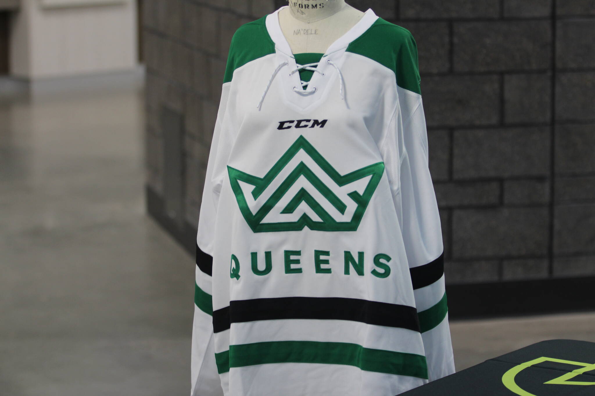
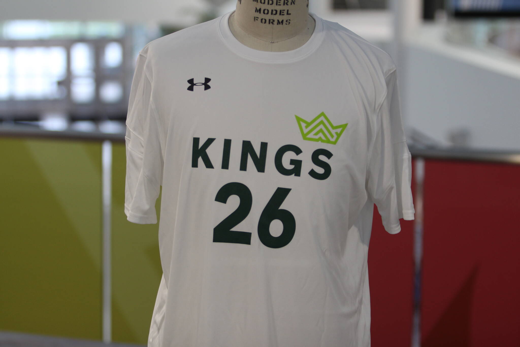
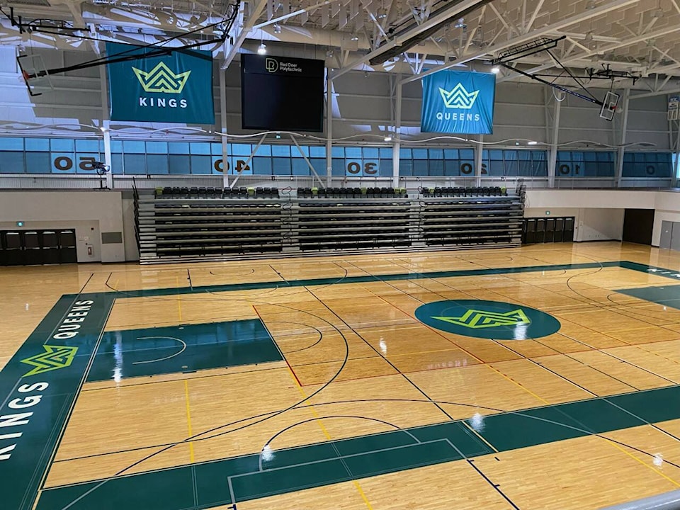
Red Deer Polytechnic Athletics unveiled Thursday morning a new logo and a refreshed brand for the Kings and Queens at the Gary W. Harris Canada Games Centre.
Bold, modern, and fierce were the words used by staff to describe the new look, which pays homage to the history of the school’s athletics that have been around since 1964.
Kristine Plastow, dean of students said those three words were just some used during stakeholder engagement sessions and an online survey to find what people wanted out of a refreshed brand and logo.
“In designing, which was all done in-house, it was our marketing and communications team that did all the work and the graphic designing for it and so that was really the pieces that came out for the themes,” she said.
The legacy continues.
— Red Deer Polytechnic (@RedDeerPolytech) June 23, 2022
Starting today, @RDP_Athletics will begin a new chapter of its storied legacy with a refreshed, bold, modern look! Watch out for the refreshed brand as our Kings and Queens gear up for the fall 2022/2023 @ACAC_Sport season. More: https://t.co/SlE2AZnh5V pic.twitter.com/6QmpYrC0PV
Randy Stewart, manager of athletics and student life said the idea of the rebrand began last fall and in January put the wheels in motion with a plan. They put an emphasis on community input including alumni, sponsors, staff, and students.
To those who offered input, it was important to keep the crown but Stewart said community, excellence, and legacy were other words people were hoping to see in the logo.
“The crown, the previous crown was something almost like a magical type of logo. There was something that inspired and evoked a feeling in people too,” Stewart said.
Here’s what some of the uniforms will look like once the season starts pic.twitter.com/2quokjo7n0
— Ian Gustafson (@IanGustafson12) June 23, 2022
He added the new modern look will connect well with their student-athletes and will be proud if not prouder to wear the logo. At the beginning of the 2022-23 ACAC season, all the teams’ uniforms will have the new logo and colours displayed on the jersey come their first game.
Vice president of external relations Richard Longtin said the brand, just like the institution itself has a history.
“As I was saying before we got 5,000 (athletes) that have gone through the program we’ve got to stay connected to them because they’re going to be coming to not only look to the institution but to reskill and upskill throughout their life but there’s a proud history there and I’m glad today we’re building off of that,” Longtin explained.
Allan Ferchuk, who joined Red Deer College in 1973 coached the Kings hockey program and was academic chair and athletic director for nearly 20 years before retiring, gave his opinion on the new logo.
“I think they respected the legacy and the crown and the Kings and Queens’ names and I think that recognizes and respects the legacy tremendously. I’m quite impressed,” he said.


