TORONTO — C.S. Richardson remembers where he was the first time he saw his 2007 novel The End of the Alphabet rendered for an e-reader screen. He was sailing through the air on a flight to Portugal, but seeing the clumsy design of his book brought him right back down to earth.
See, in addition to being a published author, Richardson is also the vice-president and creative director of Canadian publishing for Random House Canada. He has designed more than 1,500 books over the course of his career, including works by Ann-Marie Macdonald and Vincent Lam.
So when he narrowed his eyes at the bleak little image beaming from his iPad, he was distressed both as an author and a designer.
“I look at my own book in the e-format and I want to run from the room,” said Richardson, who physically cringed when characterizing his reaction to seeing the design.
“I hated it . . . . From a purely esthetic point of view, ebooks are horrid. They’re just awful.”
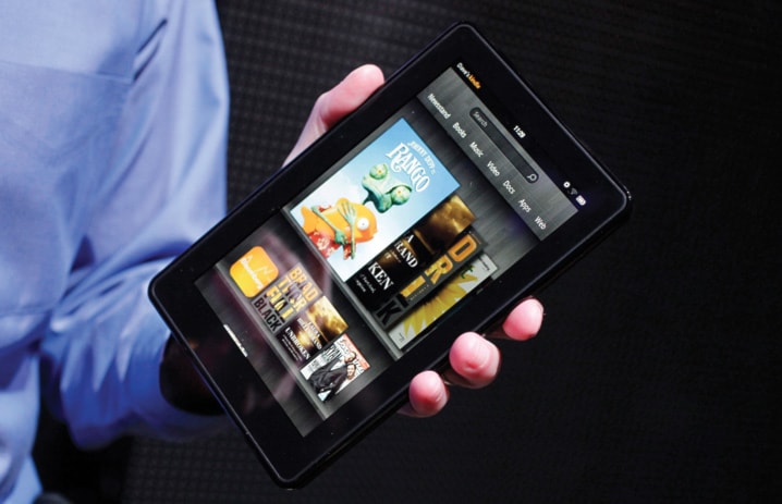
“You lose a lot of the subtle details. You lose a lot of the fine typography.”
And then there was the cover. What was once regal and refined as a physical book was something else entirely when shrunk down to fit the screen of a portable device.
It’s a cover compromise that most e-reader enthusiasts have come to accept. Whether browsing tiny thumbnails online, squinting at a blurry image on a mobile device or observing a once-vibrant book-jacket design recreated on the shrunken, sometimes-monochromatic screen of an e-reader, ebook consumers have grown used to sacrificing the artistic appeal of a carefully crafted book in favour of convenience.
But given the eroded elegance of some ebook transfers and the fact that ebookworms don’t necessarily make their reading decisions while strolling through bookstores, it begs the question: do readers hooked on digital devices still judge books by their covers?
“When I read an ebook,” Richardson said, “I don’t even pay attention to the cover.”
And depending on how many people feel the same, traditional notions of what makes for a good book cover could shift.
Book design is largely regarded as an art, not a science. Richardson, for instance, has theories on what makes for effective artwork — “a successful cover design is treading a fine line between catching someone’s attention in a bookstore and being respectful to what the book is about,” he says — but concedes that he has no “hard evidence” of how design affects consumer behaviour.
Instead, he says, such theories are merely educated guesswork because the publishing industry has rarely been interested in the sort of minute marketing details.
Still, most covers are designed with at least some thought given to attracting the wandering eye of a prospective reader scanning the bookstore shelves. But most ebook consumers simply don’t shop that way, observers say.
“The way that people buy ebooks . . . they don’t buy them in the same way that you would buy them in a bookstore,” Richardson said. “Most books in a bookstore are bought on a whim. People wander into a bookstore, they don’t know what they want . . . they see something that attracts their attention . . . and then they decide to buy.
“When it comes to ebooks, my sense is that they already know they want the book . . . or they are going to the ebook websites and it doesn’t really matter what the cover looks like. And 90 per cent of the time, the cover they see (online) is the size of a postage stamp.”